By Jamie Toth
I have a 20 year background in data architecture and analysis, so every data set is an exciting new adventure to me! I’ve written about what I found when I examined anonymized data from Oregon, so when a data set claiming to be Michigan’s THC testing data came across my email, you know I had to take notice.
Background on the Data Set
A couple of weeks ago, I had someone reach out to me and send me a data set from Michigan, telling me that it was the result of a FOIA request of METRC data from the state. That was all of the information that I really got from them.
The person who sent me the data did so in confidence, and I don’t want to break that confidence. But – they also have vested interests in laboratories in Michigan. I’ve contacted the state of Michigan in an attempt to validate that this was from them, but according to information in the file, it appears to be legitimate (it names a person who works as analyst for regulatory departments in Michigan). While it shows that someone from a lab edited it, it doesn’t show an actual edit to the file, and shows the time for those edits as 0 – so I believe that change was a filename change.

That said, let’s assume the data is real (it appears to either be real or a very good facsimile of a data set) – how should people, like regulators, researchers, or consumers – even start to analyze this stuff if they get it?
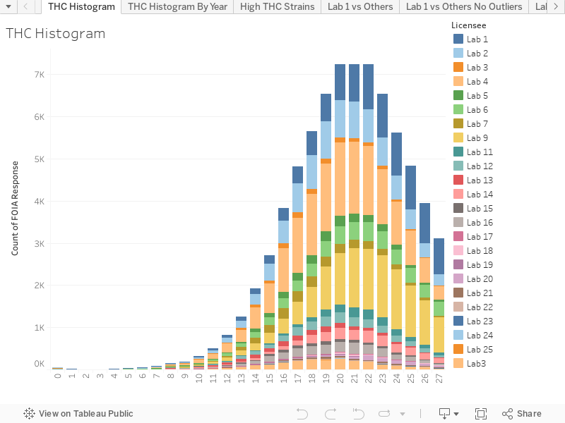
The first thing I like to look at is an overall histogram and just get some generalized statistics, especially since I don’t really have the request to go on. So I looked at the dates, and I noticed that the last tests had a ‘Test Performed Date’ of 1/3/2023 (and it looks like this date is the ‘Test Completion Date’ organized by when test results are finalized through the week). It shows that the first full month the file represents is September of 2020, which means the file appears to contain at least two full years: 2021 and 2022.

Once I got an idea of the timespan that the file represents, I took a look at how the results conform to a normal curve. I do this by Grouping Results into their Whole Number via the ‘Floor’ function in Tableau or the ‘Trunc’ function if I’m on a database level. (this way I’m not rounding upwards and causing more of a disruption towards a higher number). Here’s what Michigan’s results look like.

The curve definitely has a wee step up before plateauing, but that could just be a normal curve being a bit normal, and it bears looking into. The best, next step I’ve found is to take a look at whether or not a couple of labs are producing the most high results.

Much like in the Oregon data set, most of the high THC results (results for Flower that are over 35%) are being produced by two labs: Lab 1 with 27 results and Lab 14 with 17 results.
Just because a lab has a high number of high test results doesn’t mean that the entire lab’s data is skewed. This chart looks pretty bad at first, so it’s worth checking to see if a lab that has an overall tendency to produce high results requires digging in a bit more.
Lab 1 Results
Let’s take a look at Lab 1’s results vs. the results of all of the other labs. I’ll separate the box and whisker plots per year.

To make this chart possible, I had to eliminate some ‘noise’ at the top end of the data (there are several entries in error showing THC values above 80, etc. and I’ll explain them in a moment.), but once those values are clear, this chart makes it very easy to see that Lab 1 has higher overall THC Percentages than all of the other labs.
Lab 14 Results
Let’s Look at Lab 14 – it will also explain that ‘noise’ we saw above: all of the ‘percentage’ values that were somehow over 100.

Note that the graph is made taller by the pink dots in 2022: which are issues that are happening in Lab 14! This shows a bunch of values that are above 100 – which definitely seems like something wrong. When I dig into the data, I find the following comments on high value rows.

This definitely shows there was an issue! Once we eliminate those API-caused high values from the graph, here’s what it looks like (and it shows that overall Lab 14’s median values are inline with the other labs). (Note that Lab 14 wasn’t around in 2020, so I went ahead and eliminated that column.)
Now that we know Lab 14 had a bunch of API issues that shot values above 100 in some cases for Flower tests, Let’s revisit that graph that showed all of the high THC values, and eliminate those API issues and take another look.

As you can see, over half of all of the high THC results are being produced by one lab.
If this is the valid Michigan data set representing all of the THC results for a year in Michigan, it’s obvious that a large amount of the high THC values are being produced by the lab identified in the data set as Lab 1.
Given that I was able to analyze this data relatively easily with free tools at my disposal, I can only assume that the state has similar monitoring programs in place. Wouldn’t it be great if they would regularly share their analysis, to demonstrate the health of their cannabis laboratory program?
We Can Dream!
If you’d like to explore the Tableau Dashboard, you’re welcome to!